I often work with annual reports, including financial statements for listed companies. I do it both for investing and for my job where I want to know the financial solvency of my clients and potential clients.
One sore point with financial statements is the lack of standardization of the line items. If I want to compare two companies, one may use the word Revenues in their income statements, and another may use Sales. Even within one company, the sometimes change how they label the line-item descriptions on occasion. They are usually consistent, but not always.
The concept introduced in this tutorial, i.e., a quick and easy mapping table in Power BI, may help overcome this problem.

NOTE: This course is not meant for beginners in Power BI. If you want more information on how to quickly get up to speed in Power BI, you can look at:
Introduction to Power BI – Training that Helps You Learn Quickly
You'd expect companies to be consistent with their data items, but it's not always the case, unfortunately. But even aside from consistency within the company, there is no consistency from one company to the next.
If there is no consistency, how can one be expected to perform an analysis without having to spend a lot of time swapping out line-item descriptions? One possible method is to use a mapping table.
For this exercise, I am using a seemingly contrived example. It’s a fictitious company and the sales numbers are completely made up.
I have purposefully added several line-item descriptions that were different from year-to-year for this fictitious company. This isn’t likely to happen, and certainly not to the extreme of the example. But it does illustrate one method of helping to solve the problem.
Now, some of you data science types are saying, why not simply create a machine learning model to do all the heavy lifting? After all, machine learning excels at finding patterns. And if you are thinking this, then you’d be correct.
Someday, I will probably get around to doing just that. However, that isn’t particularly quick or easy. Besides, not all use cases would require such a robust solution. A mapping table for financial statements could probably be a good candidate for machine learning, but other use cases, not so much!
Goals of This Tutorial...
The goals of this article are to show how we can use a mapping table to solve the problem of line-item descriptions being different, even if they are referring to the same component.
Revenues, Sales, Overall Sales, and Top Line usually refer to the same measurements in financial statements. Further, you could have Revenue but it should be plural, etc.
If you look at the Income Statement table, you’ll see that there are several line items (for various years) that have different descriptions. You can see “Sales”, “Revenue”, “Revenues”, and “Gross Sales”.
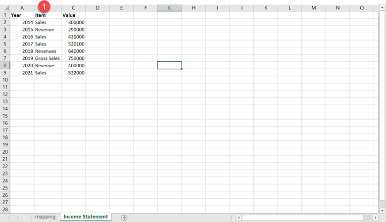
NOTE: The current version of the file (available on GitHub) contains more entries than shown here, namely for cost of goods sold, or COGS. It doesn’t matter how many entries there are, as the concept is the same. You’ll notice at the end of the tutorial that there are costs being compared to revenues and without this caveat, you’d likely be confused. You’ll see the COGS in your version of the spreadsheet on GitHub.
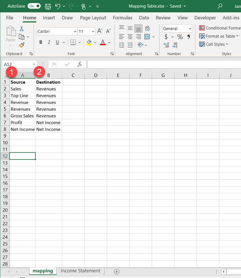
In the mapping table, I created several possible descriptions that the company has used. I have also included one that probably no company would ever use, but the word Top Line does refer to Revenues. I added to illustrate that you don’t have to worry about accounting for non-used items programmatically. The solution I present will take care of this naturally. Here is the mapping table (on the latest version the source also accounts for COGS or Cost of Goods Sold):
An Important Item to Consider…
Most financial statements list out the line-item descriptions as rows in a spreadsheet and each year (or fiscal ending date) comprise the columns. For instance, the following is an old income statement for Walmart:
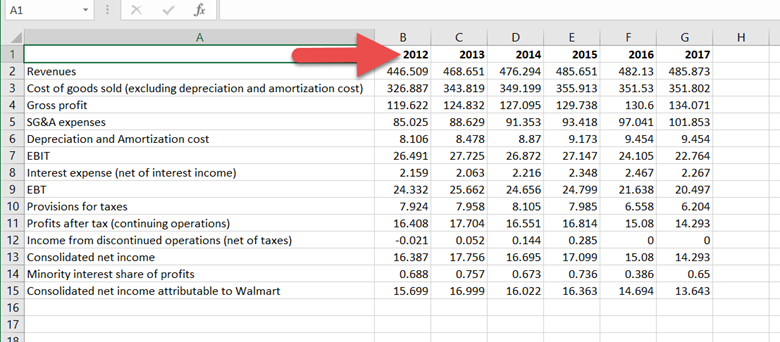
The incredible aspect of Power BI is that we can actually transform this spreadsheet into the format we need in a relatively few steps. It’s just unpivoting and renaming the columns. To keep things simple though, I am going to assume we are starting at the stage where this process was already completed.
This is more about showing you a mapping table rather than providing a robust financial statement analysis solution. But you’ll have a good starting point to create one for yourself!
Overview
Now that we got all the caveats out of the way, we can proceed with the tutorial.
First, though, I’ll describe at a high-level what we will be doing.
- Load the income statement and mappings in Power BI.
- Make sure that the two tables have the proper headers and remove null values or empty values, if any.
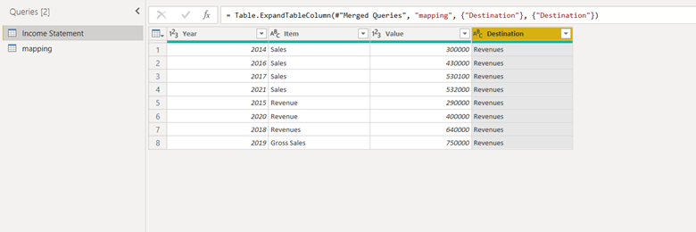
- Once the data is clean, use the merge function to match the Source of the Mapping table with the Line Items of the Income Statement. Only select the Destination column when the merge is complete.
- The Destination column is what we will use for the Line-Item descriptions after the Merge operation is complete.
If you are not quite familiar with how Power BI works, you may be wondering if you have to go through this process each time you load up the Income Statement. And the answer is no. The ETL process records all the steps for you (almost like an Excel macro, but more powerful!)
Related: How to Get Started with Power BI
1
Open Power BI
The program should be installed before trying out this tutorial. If so, simply run the program and the splash screen will display:
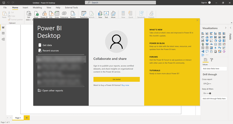
Close out the splash screen:
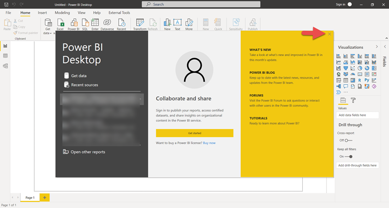
It goes without say that you’ll need Power BI (desktop) to be installed to try this on your own. I will not provide instructions on how to install the software as there plenty of tutorials available elsewhere. Besides, it’s relatively straightforward. There should be no trouble with this step.
Related: Learning Power BI is almost a breeze when you have the right instruction at your disposal.
2
Get the Mapping Table
Download the spreadsheet file from GitHub and save it to a location that you will remember where it is located.
3
Load Spreadsheet into Power BI
1) Use the Excel Workbook Connector
2) Open the Mapping Table.xlsx (wherever you saved it in Step 2)
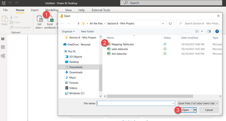
After Power BI finds the file, it will ask for more information on what you want to include from the spreadsheet. Make sure that the Income Statement and the mapping checkboxes are checked:
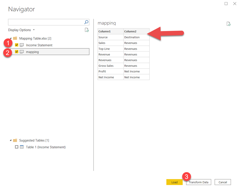
NOTE: you can see once you select the mapping table that the column headers are not correct. We can fix this by selecting the Transform Data button (red circle 3).
Be sure to have the mapping table selected (red circle 1 - it should be selected already):
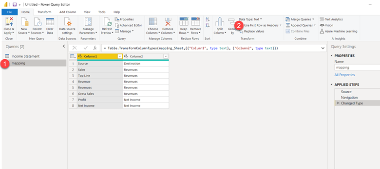
The red circle 2 is the location of the option to "Use first row as Headers".
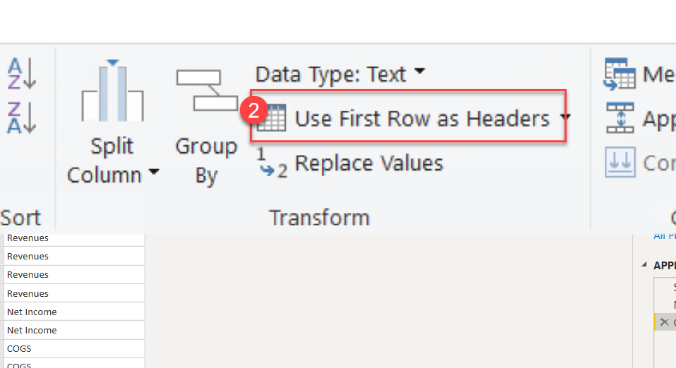
Choose that option.
Once done, you’ll see that the first row of the mapping table becomes the header row.
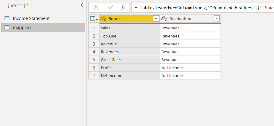
Select the Income Statement table next. You can see that the headers are correct, so the option to Use First Row as Header should not be used.
This table looks good to go, so there are no transformations to consider here.
4
Merge Destination Column to Income Statement
This is the step where the rubber meets the road. It is allowing Power BI to do its magic to make your data processing easier to get your work done.
Select the Income Statement table and then choose the Merge option:

When you click on the Merge Queries option, a drop down will display:
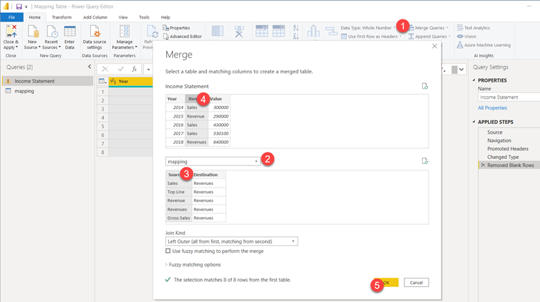
For this, following the steps in red circles from 1 – 5:
- Choose the Merge Queries option (already done).
- Select the mapping table.
- Choose the Source column for the mapping table.
- Choose the Item column for the Income Statement table.
- Click the OK button.
This is what the screen should look like when these steps were followed:
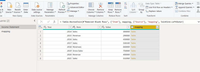
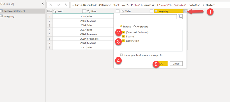
- Click on the options for selecting columns to include as part of the merge.
- Deselect All Columns.
- Select the Destination column.
- Make sure the “Use original column name as prefix” is NOT checked.
- Click the OK button.
If all went well, your screen should look like the following:
5
Close and Apply Changes
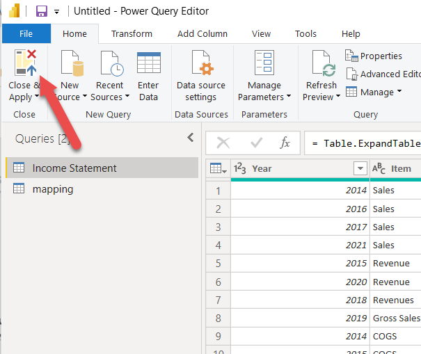
On the upper left-hand corner of the Query Editor (what you've been working in) click the Close & Apply button:
Why This Matters?
You may be thinking, what the heck is the point of all this? The answer, of course, depends on the use case. For the use case I described, it is important. I won’t get into how to set up the following visualizations because that will bloat this tutorial and I like to keep them short and sweet and stay on focus. But you can see why it matters from the visual that I did create:
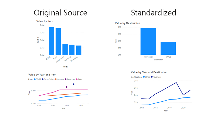
Managers and investors like to see if their revenues are greater than their costs. They also want to know if the trends of these elements are heading in the right direction. For instance, if costs are rising at a faster rate than revenues, that will cause problems for a company in the long run, even if the costs are currently lower in comparison to sales.
Of the two scenarios above (Original Source and Standardized), which do you think can give managers and investors the information they need? Remember that Standardized is the result of the mapping table transformation using the Merge option.
By merging all the fields that are considered revenues into one field called revenues, Power BI can treat that as a single unit. That is simply not possible to do with all the disparate sales elements. It’s also much easier to analyze trends (bottom charts).
Mapping tables aren’t a new concept. They are often used for many-to-many relationships or sometimes used when making changes to keys in a table. Could other methods be used to accomplish what we wanted from this article? Sure. If the number of items to map is small, you could use a conditional column to handle it. I also mentioned about finding patterns using machine learning.
This concept is not likely to be something you use often. But knowing how it’s done can come in handy when you find yourself with a scenario that needs this type of solution.
Learn Power BI Now!
Click on the START button to see how you can learn Power BI from one of the top training companies in the data science industry. You can even try out the first chapter for free!
