Power BI is an analysis tool created by Microsoft. It is part of a class of software tools known as self-service business intelligence tools, which means that it is supposed to be easier than most analytics-based tools. However, it still has a learning curve that users need to master. This tutorial will help you get your start in learning the tool.
Power BI is an analytic tool that allows users to build sophisticated reports. These reports go above-and-beyond the capabilities available in Microsoft Excel. In fact, Microsoft tried to retrofit Excel to provide the type of features available in Power BI, but the company felt it was easier to start from scratch.
If you are familiar with Pivot tables in Microsoft Excel, then you have a glimpse of what Power BI can do. However, pivot table functionality only scratches the surface of the power that is generated by Power BI. Experienced Power BI users would readily agree that the software is much more than an enhanced pivot table. If they didn’t agree, their expertise would be seriously called into question.
Power BI is not difficult per se, but it has subtleties that trip up even experienced users. It takes practice to master the program, but it won’t take years like many analysis software packages.
Start with Data
I’ve experienced several tutorials in Power BI. Many of them were quite good. However, in almost all cases, the instructors present full-scale data models, which can leave novices feeling overwhelmed about how the tool ties all the pieces together.
Related: Learn how to create mock data that is realistic and robust.
I am taking more of a bottom-up approach by working with a single table with only a few records. This will help you see the relationships easier. It’s not a method you should ever use to structure your data for your actual projects. However, as we progress with the lessons, we’ll build out the data model in the proper manner.
This approach will help you in a few ways. First, it will let you see how the tool works without getting bogged down initially with the relational aspect of multiple tables. We’ll start with a single table that has all the needed data for the first set of tutorials.
Second, if you work with clients who have data sitting in Excel sheets, chances are these sheets will contain most of their data (and implied relationships) within one spreadsheet. They’ll record a transaction, including the products sold for that transaction and the full details of the customer all on one row of a spreadsheet. This will repeat for each transaction.
From a client’s perspective, this helps them easily see all the data, and they can reference customers or products by performing a simple Excel search. Because the data is in this format, which is how we’ll start our analysis, you’ll be an old pro at transforming the data when you go through these tutorials. You’ll be capable of taking these transaction = Excel row spreadsheets and get them into a proper format where Power BI will perform at its best.
Scope of Part 1 of the Project
To try and teach an entire Power BI course in one tutorial would not do it justice. There’s simply too much involved. Therefore, I’ll break it down into several tutorials. This will also serve as a good reference when you need to reinforce concepts.
The scope of part 1 is to learn about a sales table data structure that contains only a few Excel rows. For this beginning tutorial, the columns in this table will contain:
- Order ID
- Transaction Date
- Customer ID
- Customer Name
- Product ID
- Product Name
- Quantity
- Price
- Amount (Quantity x Price)
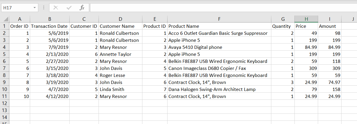
The customers are fictitious. The products are real products, but don’t represent actual prices. The Transaction Date contains transactions for the previous year and the current year (at the time of this writing). This will come in handy when we explore date concepts later.
The data is contained on my GitHub page. Download the data to following along.
Start Power BI Desktop
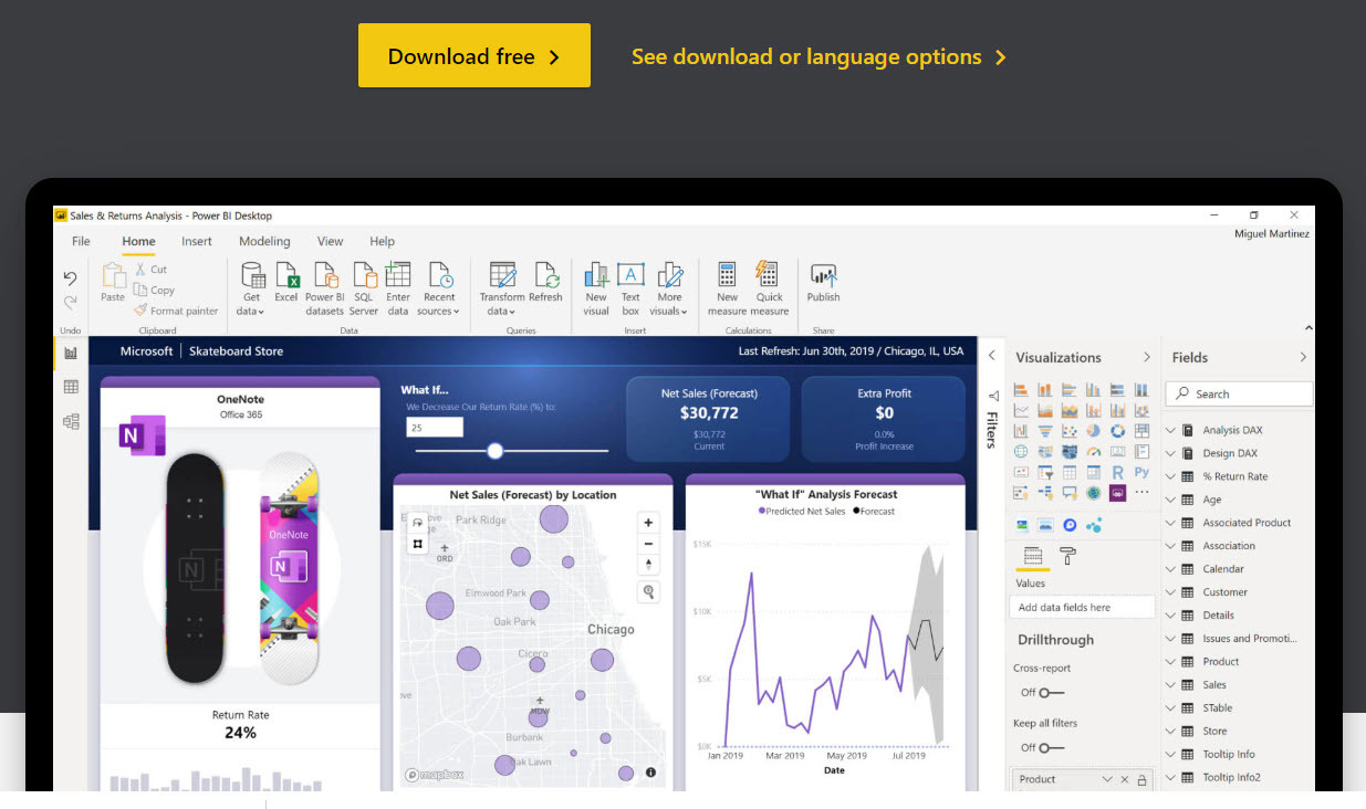
NOTE: this tutorial assumes you already have Power BI Desktop installed. If not, please click on this link to install it. It's free and easy to install. You can also click on the image:
When Power BI first starts, you’ll see a splash screen. You have the option of loading the data (1), or close out the splash (2), which then you can load the data inside the program. Which you choose is a personal preference.
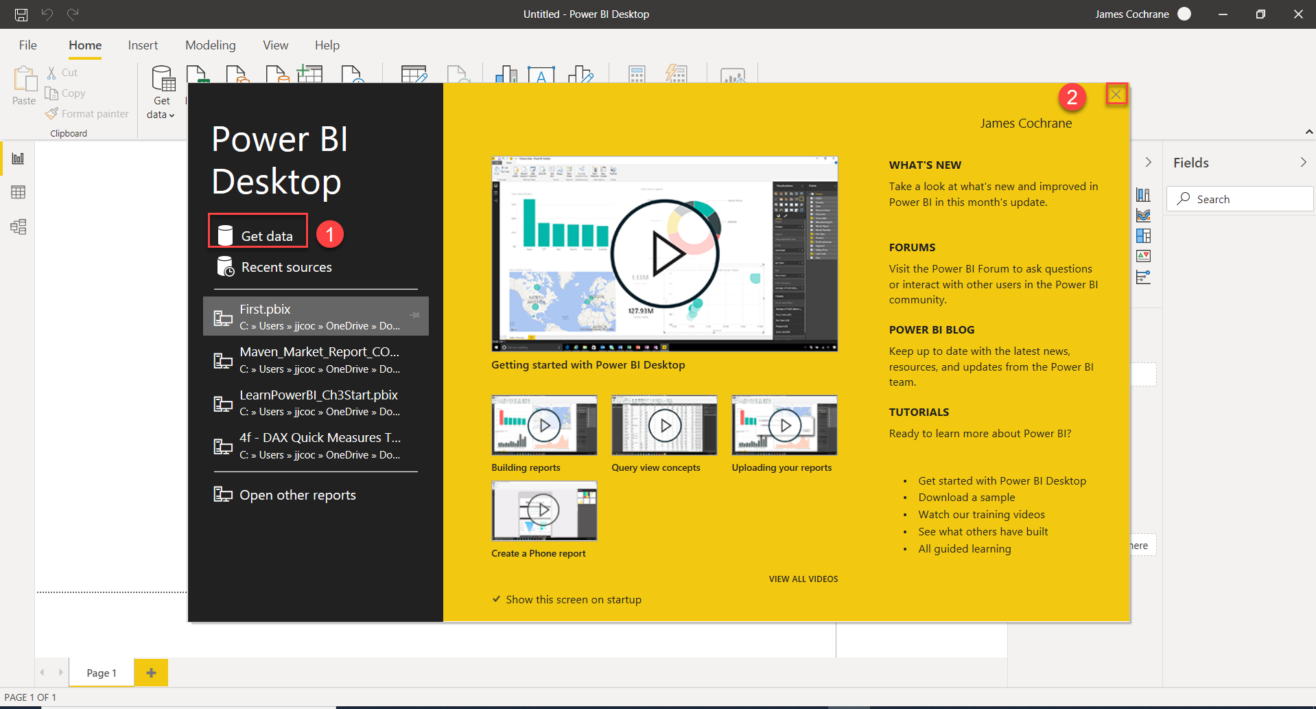
Image Courtesy of Microsoft.
For this tutorial, we’ll close out the splash (2). Then, we’ll open the file from inside the program.
Related: Why you should learn Power BI
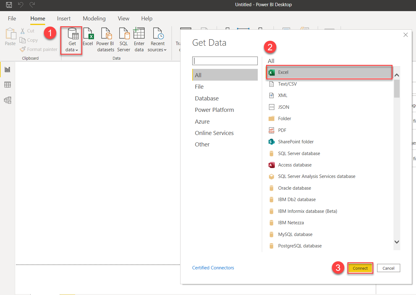
After the Splash page is closed, on the Home page, follow the sequence of steps:
- Select the Get Data button.
- Make sure the Excel option is selected. We’ll cover the other options in more detail later. Since our data is contained in an Excel spreadsheet, that’s the option we’ll use for this tutorial.
- Click on Connect.
A file dialog box will appear after you hit the Connect button. Locate the Excel file that you downloaded previously. It’s called Sample Data.xlsx. I gave it a generic name for a reason, which we’ll explore later.
The Power BI Excel connector will recognize any sheets that you have defined within your workbook. This is convenient to create multiple worksheets that each represent a specific table. For instance, later, we’ll separate customer and product information into separate sheets. They’ll appear in the list above (1) with whatever name you assigned to them.
I mentioned before about naming Sample Data.xlsx to illustrate a point. When you start working with production data, you’ll find many data sources without good naming conventions. However, when you define your own spreadsheets or advise clients on how to create theirs, try to make the names as descriptive as possible. A better approach above would have been to name the spreadsheet Sales.xlsx and the worksheet Orders. Luckily, we can change this easily in Power BI.
The following are explanations of the steps in the illustration:
- Click on the Sheet name to have it display in the preview window to the right. When you see that it’s the right information, select the checkbox. If there are multiple sheets, do this for each that you want included in your data model (more on this in later tutorials.)
- Click the Load Button, if you don’t want to perform any transformations on your data (not recommended).
- Choose the Transform Data button to set up the transformations of your data. This is usually the best approach as you can clean up much of your data using this option.
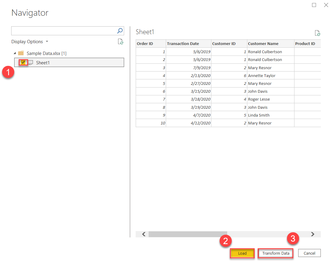
Not shown in the illustration – select the Cancel button if you want to abort the loading of data.
Transforming the Data
In keeping with proper data procedures, I have clicked the Transform Data button which leads me to the Power Query Editor. For this tutorial, we want to change the name of the table, and check to make sure that all the fields are assigned their appropriate data types and that all the headers look correct.
The Power Query Editor is more complicated than it looks. Suffice it to say that your data should load up properly when you load the example file provided. It should look like the following:
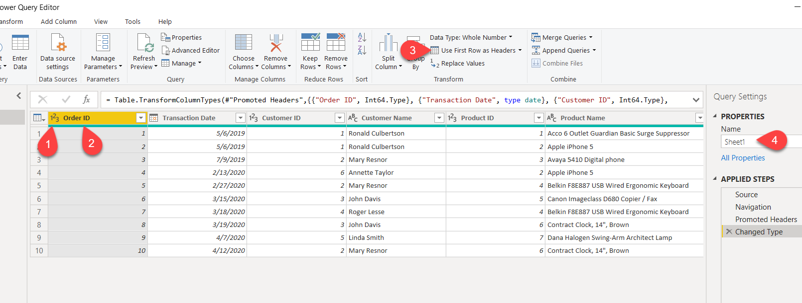
Here are some tips if the data doesn’t look right (numbers below refer to numbers in illustration):
- Each column has a data type and column name. The data type is located to the left of the column name. This data type is clickable and is the area of the header that you can change the data type. Power BI has identified the first column Order ID as a number. For this stage of the tutorial, it will accept this data type, but see the next step (2) for more information.
- As Order ID is not going to be used for calculations, you could choose to make it a text-based data type (even though it will show as a number). Sometimes, Power BI creates situations during the analysis that make users scratch their heads wondering why they did what they did. If a numeric column is not meant to be used as part of any calculations, it may be worth it to change its data type to text. This will eliminate the issue altogether. I’ll show you an example of this later.
- The headers should match what is in the spreadsheet that you loaded. If the headers from the spreadsheet appear on the first data line rather than as column names, Use the “Use First Row as Headers” option.
- Change the Name Name of the table to something meaningful. Since we are working with orders, you can use that as a name. For the purposes of this tutorial, I’ll name it Transactions.
Once your happy with how the data looks, click on the Close & Apply button.
Instead of trying to learn everything you need to know about the Power Query Editor, I feel from my own experience that it’s better to learn as you go. As we use new functions with the feature, I’ll explain them at that point in time. I tried to learn it all in a few short sessions and it only served to confuse me. It’s complicated, but powerful, and it is worth every effort to learn it, but not all at once!
Related: How to Load Scripts Into Power BI
For reference, I have included the image of the Excel spreadsheet to compare the columns in Power BI:

The Building Blocks for Analysis
The foundation that you build from this tutorial will help you understand the more difficult aspects of Power BI easier. I always found it difficult with tutorials that I learned from to tie out the numbers that Power BI reported. There were simply too many tables and too many rows. By keeping the table count to one initially, and the row count to 10, you can easily tie out the numbers without a lot of effort.
Having said this, it may seem like Power BI is nothing special during this initial learning effort. You’re likely to think that you can do everything I show you in Excel, and you’d be right, at least initially. Just keep in mind that as you build those blocks of knowledge, this early stage will serve you well in understanding why Power BI performs the way it does.
The first step is to create a table element type on your workspace. Don’t worry, there is nothing scary about that. It’s quite easy. First though, we need to make sure we are in the Report area.
After you finish the previous step of transforming your data, Power BI should have brought you to the Report area. If not, simply select the Report icon:
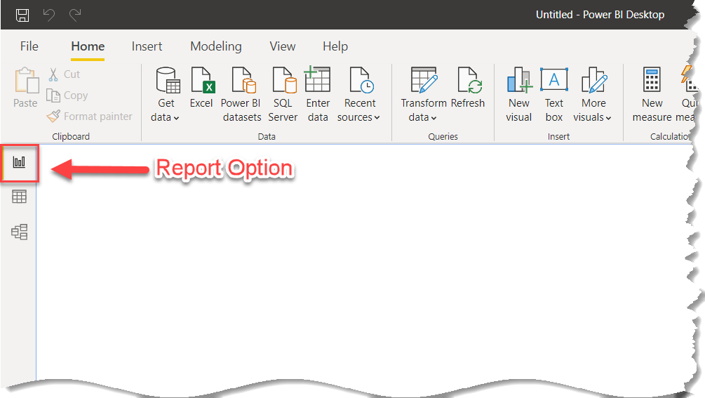
The Report area allows you to add features and move them anywhere you like. It’s What You See Is What You Get (WYSIWYG). This gives you the most flexibility possible. Our first task is to create a table. Once that occurs, will continue to add data items from the Transaction table.
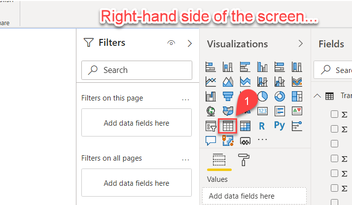
When you click on the Table visualization (1), it will create a blank table somewhere on your Report area. It’s easy to move if you don’t like where Power BI placed it.
Now, it’s time to fill the data table with information from our Transactions table. We’ll start out with the Amount column, which represents the sale amount. Make sure the Table element is selected, and then click on the Amount checkbox (1) on the right-hand side. The empty Table element will show the Amount field with one number (2):

It may seem a bit off putting visually that step 1 is on the right and step 2 is on the left. Unfortunately, that is where the elements on Power BI exist. Follow the steps in order.
Question ***
There are 10 orders in the transaction table, why is there only one number for the Amount in the table element? What does that number represent?
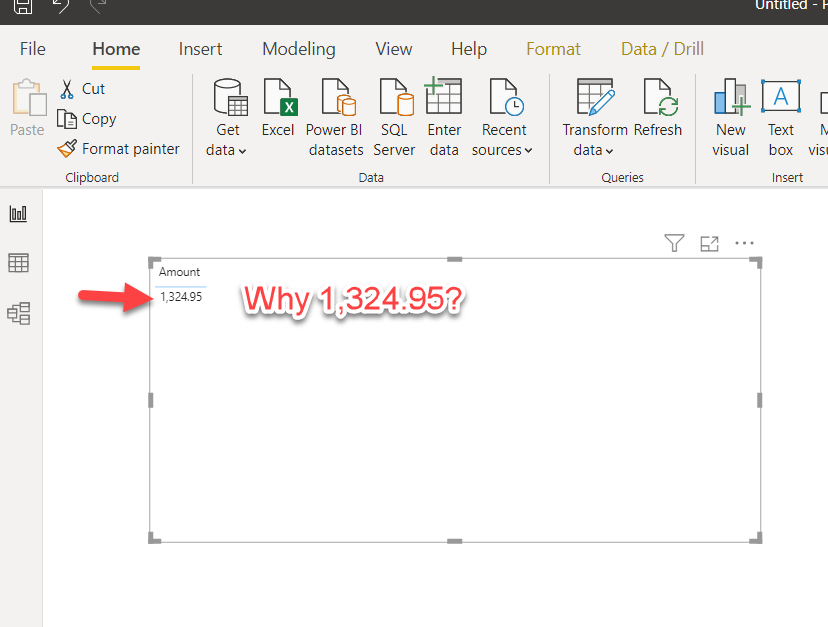
Take a look at the Excel sheet (this time I summed up all the Amounts):

By taking the sum of all transactions, you can see that the Amount field ties out with the Table in Power BI. The reason it shows only the total is that is all we asked it to do. The context in this case is for an amount. Power BI has no other information to go on except that we want an amount. Therefore, it will aggregate the Amount with the sum of all the Amounts, as that is the only instructions we have given the engine.
It doesn’t know to sum up the amounts by date or by customer because there is no date or customer included in the table. It can’t sum up by product because, as you guessed it, there is no product information in the Table element that we included on the canvas. There are date, customer, and product fields in the table that we loaded (Excel). However, since we didn't include them in the visualization, Power BI won't use them as part of determining what to display.
Hopefully, this makes sense. It’s one of the core concepts that you’ll need to grasp.
Reset Mode
I created an artificial concept called Reset Mode, and I’ll explain why below. It's not something that exists in Power BI. It involves making sure all fields are unchecked for the table (if anything is checked, uncheck it). Then, you can select the fields for the new scenarios that you want to explore.
Why Reset Mode? Rearranging fields is a bit tricky to do in Power BI, and even trickier to explain via a tutorial. Therefore, after each iteration of scenarios, simply do a Reset Mode. Your table should have nothing checked after resetting:
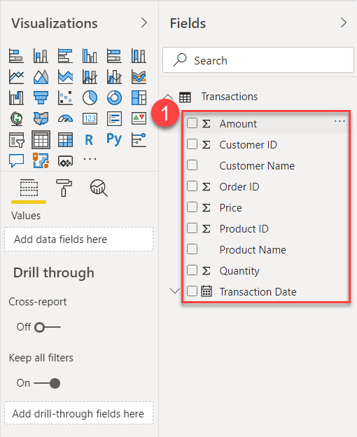
I'll usually let you know when to do a Reset Mode. Don’t reset unless we are discussing some new scenario. In other words, if you add the Product Name and amount, I may ask you to add the customer name also. That set of tasks is part of one scenario and you can keep adding to the scenario until I suggest doing a Reset Mode.
Note: Once you get used to the interface in Power BI, you’ll be able to rearrange fields without having to do this Reset Mode. It’s to make the creation of scenarios easy and to match the same as what is shown in this tutorial.
Don't worry. This is just until you get used to the interface in Power BI. You won't need to do any resetting when you learn how to add and move fields.
If you are comfortable with rearranging fields, feel free to skip the Reset Mode when instructed to do so.
Do a Reset Mode Now
It’s time for our first Reset Mode. Simply clear out all the fields in the Transactions table (see image above). Refer to the image any time you are instructed to do a Reset Mode going forward. All that you need to do is uncheck any fields that may be checked. Then, you are ready to add the fields for your new scenario as I tell you to. Also, follow the sequence as the order of fields matters in how it's placed on the report entity (in our case Table).
Amount by Product
To recap, by adding only the Amount field to our first scenario, it will show a total amount for all transactions. This was due to the fact that Power BI had no context, other than the Amount itself, with which to display the Amount. The only logical choice is to sum up all amounts, which is the context it can know to work with. Nothing else is available in the report table, only Amount.
For instance, did you want to see the amounts by customers or amounts by products? Both of these will produce different results than the other. Can you see now how Power BI has no idea which to choose? Therefore, it will choose from the information we gave it, which is to summarize the Amount field across the entire table.
After our Reset Mode, lets add the Product Name and the Amount. The order which you add fields matters, which is the whole reason why we have to do the Reset Mode. Product Name first (1), then Amount (2). Always make sure your Table element is selected before selecting any fields, though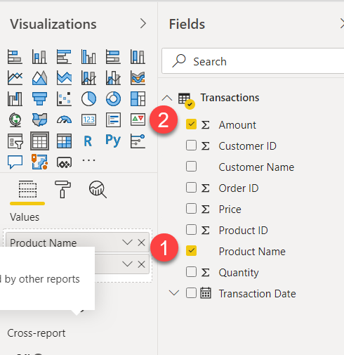
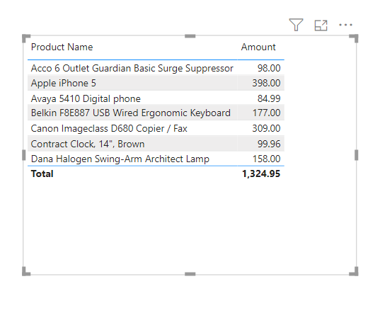
When you select these field in the right order (1,2), then your Table should look as follows:
NOTE: if the field order gets mixed up, just do a Reset Mode again and start over. Product Name field first, followed by the Amount field.
Take a look at the Excel spreadsheet:

In the Power BI Table, there is only one Apple iPhone 5 listing. However, in the Excel spreadsheet (source of our data) there are two Apple iPhone 5 products. Why?
It has to do with context, just list it did for the standalone Amount scenario. In this new scenario, we are asking Power BI to display the Amounts by Product. But Power BI has no indication of the number of orders for those products based on the information we asked it to provide, i.e., Amounts by Products only, so the only thing it knows to do with the amount is to aggregate based on the product.
For each product, it will total the Amount for those products, without regard to customers or orders. It’s doing exactly what we asked it to do, i.e., give us Amounts by Products.
For each of the products where there was only one sale in total of all orders, the Amount shown in Power BI will match the amount in the Excel spreadsheet. For instance, for the product Avaya 5410 Digital phone, there was one sale for $84.99. Check out the Power BI table for that product. It shows $84.99 for the total for that product.
Check out the highlighted (in yellow) products in the spreadsheet. All three of these products have two sales on different dates. For instance, the Apple iPhone 5, shows two sales by two different customers on two different dates. The amount for each of these is $199. The Power BI Table, on the other hand, shows only one line item for that product, but the amount shows $398. If you add up $199 x 2, it ties out to the $398. Once again, the context we have requested (Amount by Product) only knows to take each product and aggregate them, irrespective of any other field that is not included in the report element (Table).
For Kicks, Let’s Add the Order ID
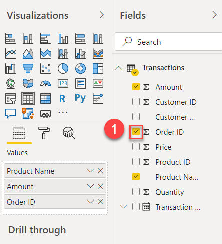
No Reset Mode here. Add the Order ID to the same scenario by clicking the checkbox on the Order ID (1) to add it to the end of the table.
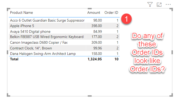
We are adding in the context of Order IDs. This should now help Power BI with the context of Amounts by Product by Order ID. However, if you notice in the Table, it seems to have kept the aggregations without any changes. Why?
Question ***
Why did the context not change when adding the Order ID? It seems intuitive, at least, that the other order IDs would appear in this Table. Hint: try to determine how Power BI interpreted the Order ID. What type of value does it look like (based on the products)?
What happened here is that Power BI was free to interpret the Order ID in a manner that it believed it should be or how the software “thinks” we would want to view it.
If you guessed that the software interpreted Order ID as a count of products, you would be correct.
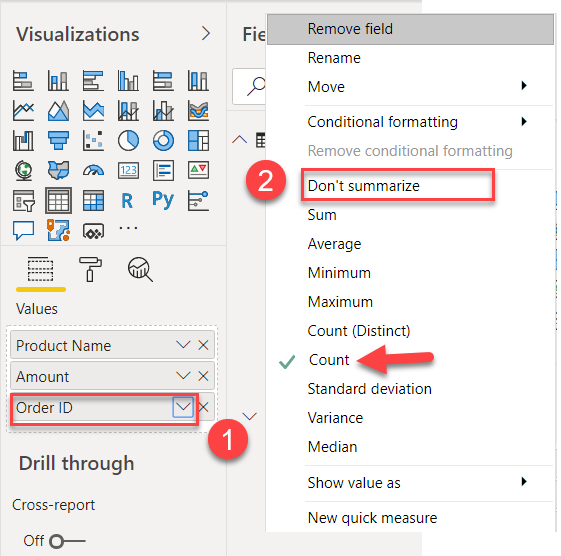
You can change the type of aggregation in Power BI. The SUM aggregation is the default, but when Power BI believes SUM doesn’t make sense, it will choose something else, usually counts.
When you change the Order ID from Count to Don’t summarize, you’ll see the context will adjust appropriately. In other words, the proper Order IDs will appear (1):
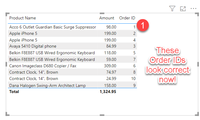
Question ***
Should Power BI have used count for a field that serves as an identifier, i.e., Order ID?
This is that situation I described earlier about assigning numeric data types to ID fields. Technically, Power BI has no way of knowing that an ID field that is a number should be treated as an ID field. It’s just a numeric type like any other number.
This aggregation situation is one of those subtle annoyances with Power BI. Power BI should never have even considered Order ID as a count, unless we explicitly asked for a count on the field.
Related: Make Your Data Definitions Work Correctly in Power BI
Had we made the Order ID text-based during the transformation phase, it’s not likely that Power BI would have chosen the Count as the aggregation. In fact, it would not aggregate at all. It would choose Don’t Aggregate by default.
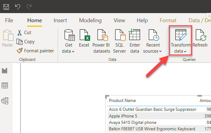
Let’s change the Order ID to a Text data type. Click on the Transform Data, and the Power Query Editor will open with your tables/fields.
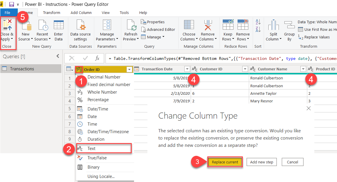
- Click on the data type for Order ID (to the left of the column name Order ID).
- Change the type to Text.
- If a Popup Dialog appears to Change Column Type, click on the Replace current button.
- If Customer ID and Product ID are numeric, change to text using the same procedures.
- Click on the Close & Apply button.
NOTE: Sometimes, Power BI can reinterpret some of your columns after making significant changes. This usually happens when you add or subtract columns in your Excel worksheet. It can also happen when you fiddle with the settings in Excel. In most cases, this won’t happen, but it’s possible. Run through the column list to make sure the types were interpreted correctly. Make changes accordingly.
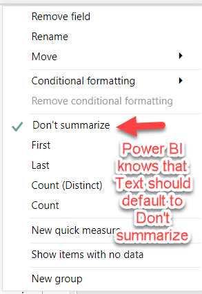
Uncheck the Order ID, and then immediately check it again. This time, it will display correctly, which is the Order ID itself, rather than a count.
Note that there is still an option to choose Count in the list of aggregations. However, with text data types, Power BI knows that the user won't likely select count as a default. The default for the data type text is Don’t Summarize:
Questions & Exercises
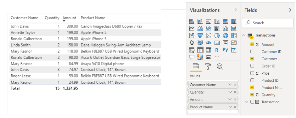
Take a look at the following:
Question 1
How many sales did John Davis have in total?
Question 2
How much did all his purchases cost him?
Scenario 1
Is there a way to get Power BI to answer Question 2? In other words, can we set up a query to display the total Amount that John Davis spent overall?
To figure this out, set up the scenario with a blank table (Reset Mode) and add the following fields (in order):
- Customer Name
- Quantity
- Amount
- Product Name
If you set it up correctly, your table should look like the one above.
To get the answer from Power BI about how much John Davis spent in total, uncheck one of the fields. Which one should you choose? When you choose the correct field, you’ll have the answer you need. See the answers below.

Answers
Question 1 – John Davis had two orders. The first one on March 15, 2020 and the second on March 19, 2020. He bought one quantity of a copier/fax and three quantities of a clock. You could either check the spreadsheet to answer this question, or you could have set up a query from the Transaction table as follows:
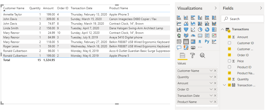
To get the columns in order shown above: Reset Mode - Customer Name - Quantity - Amount - Order ID - Transaction Date - Product Name.
Preferably, you chose to let Power BI answer the question for you.
Question 2 – Add up the amounts for John Davis. Here is a repeat of the image from the question to help you:

Note that the Amount is the total price (quantity x price). Therefore, John Davis has two line items in this scenario. $309 + $74.97 = $383.97.
Scenario 1 – Using the same table with the Customer Name, Quantity, Amount, and Product Name, if you uncheck the Product Name, you’ll be presented with the following results:
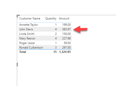
As you can see, the 383.97 matches the results when we added each amount for John Davis. Power BI was able to answer the question for us.
The goal is to have Power Builder do all the heavy lifting. Use the tool to answer questions you have about your data.
Golden Rule: in most cases, the more items you include in your Table queries, the more granular the results. By unchecking items, you can discover answers at a higher (or aggregated) basis.
Next Up...
In the next tutorial in this series, I’ll add another column representing the regions for customers. This will allow us to further aggregate or segment our data. Then, we’ll learn how to extract the dimensions or lookup information from the table and place them into their own tables. This will help to learn about the proper techniques to structure data for Power BI. We will also learn how to set up the relationships among the tables and why that is important.

