Creating stock charts requires expensive software, or at least it used to. Now, you can simply create it right from a programming languages. Even better, you can do it all in two lines of code. Nice!
What’s the Catch?
There really isn’t a catch. Of course, if you are expecting these charts to have all the bells and whistles of sophisticated software using two lines of code, you’re likely to be disappointed. However, these same Python packages can certainly measure up to the big tools when using more than two lines of code.
Need a Devlopment Environment?
If you don’t already have a development environment to run Python, I have good news: you don’t need one. You can use an online solution from none other than Google.
https://colab.research.google.com
NOTE: You will need to have a valid Google (gmail) account to use this.
How to Do It
You’ll need to install and import the yfinance package. There’s a big caveat with financial packages as they often change their support for free access. Therefore, I wouldn’t suggest using it for production-based software development, unless you enjoy troubleshooting. As of this writing, the yfinance package worked to obtain prices.
If you don’t have yfinance installed, use the following:
pip install yfinance
Then, you’ll need to import the package along with pandas.
Import pandas as pdimport yfinance as yf
Important: perhaps you think the two imports should count as the two lines of code, which won’t create any stock charts on their own. Technically, it is true that these are lines of code. However, these imports don’t do anything in any Python program. They are foundational. It’s like when chefs create five-ingredient meals, but don’t count the salt and pepper. Let’s just go with it.
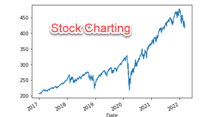
For this tutorial, we’ll use the S&P 500 Spyder ETF – Symbol: SPY
1st line:stk = yf.download(‘SPY’, start = ‘2017-01-01’, end = ‘2022-03-11’, progress = False, auto_adjust = True)
2nd line:stk[‘Close’].plot()
Wait! Is that all?
I told you this was easy. That is all you need to create a stock chart. Here is what it looks like:

As mentioned, this won’t win any awards for sophisticated functionality. But think about how little effort this took to obtain a stock price and then plot it.
Want to go extreme with this? Let’s consolidate the two statements into one. Yes, that’s right! We can chart the prices of stock using just one line of code. Pretty, cool, huh?
yf.download(‘SPY’, start = ‘2017-01-01’, end = ‘2022-03-11’, progress = False, auto_adjust = True)[‘Close’].plot()
Struggling with the Code?
If you aren’t familiar with how this code works, it’s quite likely because you don’t know Python. That is easily solved, though. You can learn the basics of Python from top notch trainers.

Be First to Comment